
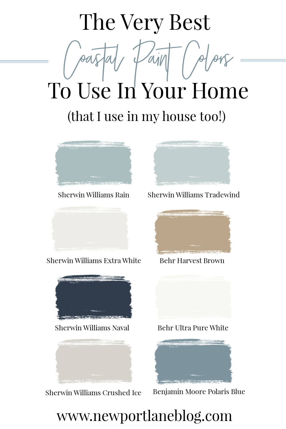
This post highlights all of the best coastal paint colors for your home. It includes all of my tried and true Sherwin Williams coastal paint colors that I’ve used in my own home!
 Affiliate links are used for your shopping convenience. You can read my full disclosures here.
If you are anything like me, choosing a paint color is agonizing with a capital A. When we were getting our bedroom painted two years ago, I struggled SO much with finding the exact perfect shade of blue. I must have put up at least 20 Sherwin Williams coastal paint colors on the wall. My painter was making fun of me and I totally deserved it. It was pretty funny! Thankfully, I loved the shade I picked for the walls, it’s actually still my all-time favorite paint color.
All of that struggle got me thinking that it might be helpful to have a guide to the very best coastal paint colors so you don’t have to struggle too! I’ve used all eight of these coastal paint colors in my own home, all in various rooms. As always, the lighting varies greatly so make sure you check out how the shade looks at different times of the day in your home. You can take a look at the very best coastal paint colors below and see where I’ve used them.
Best Coastal Paint Colors
Sherwin Williams Rain | Family Room


You can shop all of the items in my home by clicking here.
Our family room has gone through more changes than a host at an awards show. We’ve gone through so many color schemes, layouts and pieces of furniture. When we moved in, it was painted a sage green color, which actually went great with our style at the time.
About 6 years ago, we had a party and one of the kids in attendance drew very large mural in crayon on our wall. After trying without success to remove it, we decided to just repaint. We had NO idea what the actual color was so there wasn’t really any good way to match it.
Sherwin Williams coastal paint colors are awesome! Rain is a really versatile coastal paint color – it changes a lot throughout the day in this room. In hindsight, I might have considered doing more of a neutral color in here, just so that my furniture would stand out better. But we do really love it still!
Sherwin Williams Tradewind | Master Bedroom
 This beautiful shade of blue is my all-time favorite Sherwin Williams coastal paint color. I mentioned above that I agonized over this room color and it’s funny that after alllllll that indecision making, I ended up with a color that I completely adore. It’s the perfect shade of light blue – not baby-ish and no grey undertone. It’s just a really soft, calming blue and we love it!
Click on any image below to be taken directly to the item:

Sherwin Williams Extra White | Office, Daughter’s Bedroom
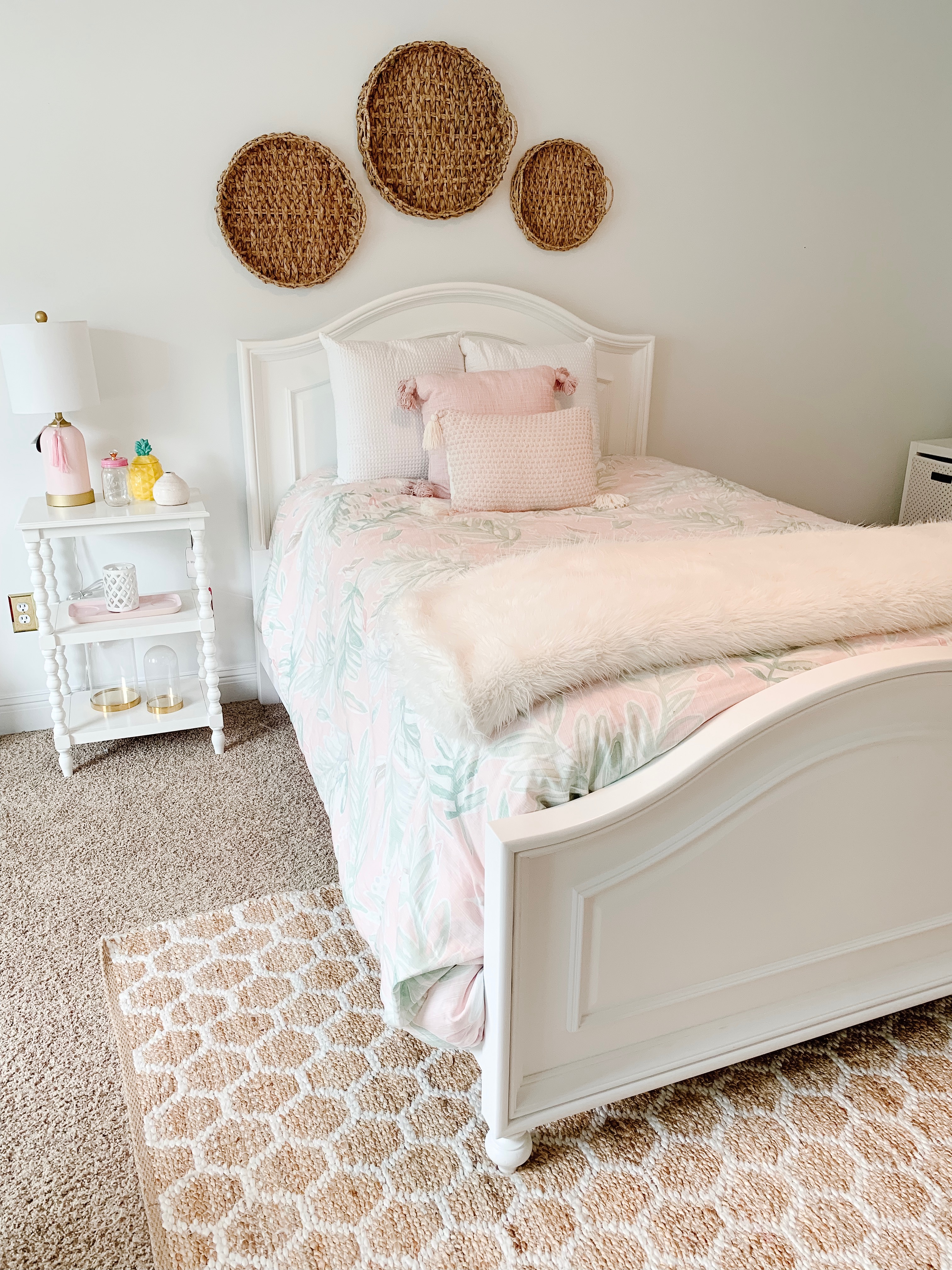

Sherwin Williams Extra White is my go-to white paint shade. It’s a perfect, true white for me. {The sample in my image at the top of this post looks like it has a grey undertone but I can verify that it definitely doesn’t!}
And while plain ‘ol white paint might not seem like a coastal paint color – there’s nothing like having a bright, clean backdrop for your home decor. I used to think that white paint was boring. Now I love it!
Click on any image below to be taken directly to the item:
Behr Harvest Brown | Foyer and Upstairs Hallway

Back when we moved into this house 10 years ago, my home decor style was super Tuscan-inspired. Lots of reds and greens and very little blue. We had painted our 2-story foyer and upstairs hallway in this sand colored shade by Behr.
Over the years, I figured out that coastal home decor and its clean, fresh style was what made my heart go pitter-patter. So I slowly started changing everything over to blues and whites but my having the foyer and hallway repainted was always at the bottom of the budget priority list. This Harvest Brown shade by Behr actually really blends in with the rest of our decor. The shade reminds me of the color of sand and it’s a nice transition to the grey of our kitchen and blue of our family room.
Sherwin Williams Naval | Dining Room, Front Door and Pantry Cabinets
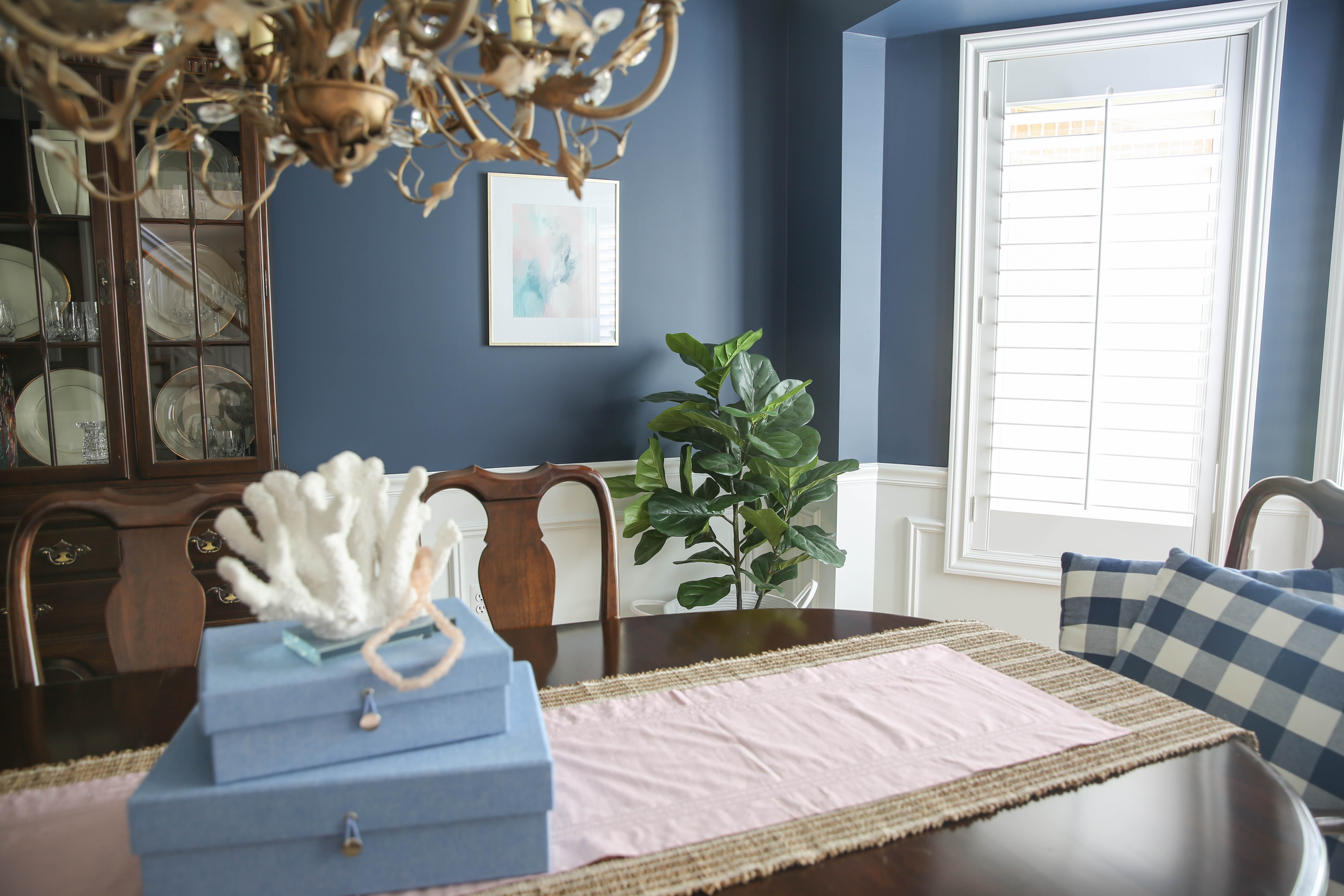


Sherwin Williams Naval is such a classic coastal paint color. We used it in our dining room, which used to be a cranberry red color. Our front door is also painted with this stunning navy blue color and I love how it turned out.
When we remodeled our kitchen, I really wanted light blue pantry cabinets but because they are only a few feet from our family room, my kitchen designer and I were worried that the two blue colors would look like we tried to match them and failed. So instead, we chose this beautiful coastal navy color which is nearly an exact match for Naval. I will say that while I love the way they look, the navy cabinets show every speck of dust and dirt so painter beware!
Behr Ultra Pure White | Laundry Room, Powder Room Trim

Please excuse our paint touch ups that still need to happen in here! #reallife
I mentioned before that I started remodeling our laundry room at the beginning of the pandemic, back when paint stores were closed. I knew I couldn’t get my beloved Sherwin Williams Extra White so I chose this Behr Ultra Pure White shade from Home Depot instead. It’s perfect! It looks just as bright, fresh and clean as our other white rooms. It’s definitely a great alternative to the Extra White shade.
Click on any image below to be taken directly to the item:
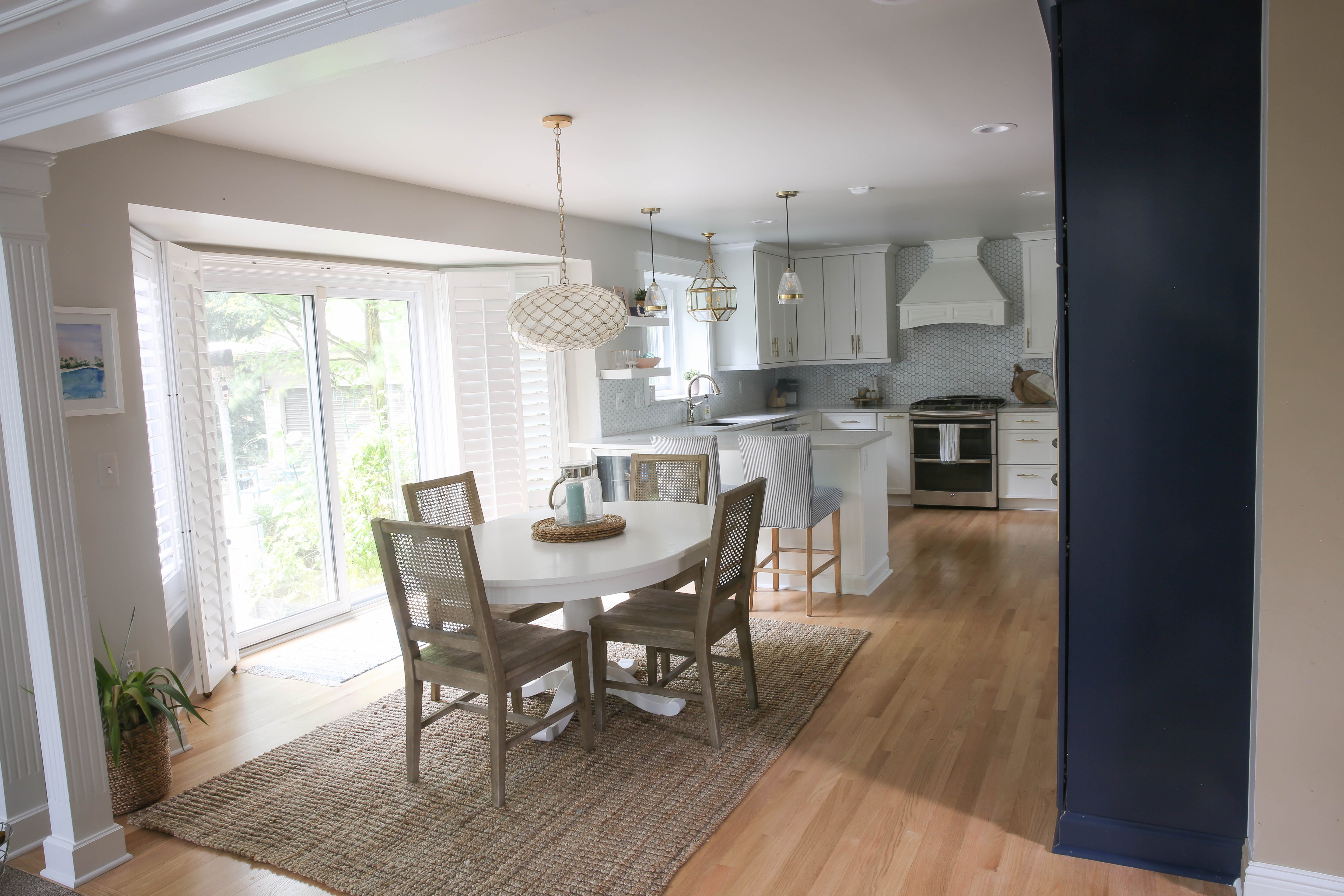
Sherwin Williams Crushed Ice | Kitchen

Click on any image below be taken directly to the item:
Our kitchen actually has very little wall space that needed to be painted. The majority of the walls are covered with cabinets or the backsplash. What you see around the door walls is mainly it. We also painted the ceiling and a hallway that’s connected to the kitchen.
My kitchen designer picked this shade of grey from a book of about a million colors and it’s perfect. It’s so light that you’d probably think it was white but it has a very slight grey tone to it. If I ever end up repainting my foyer and upstairs hallway, I’ll probably go with this. It would be a great coastal paint color for a bathroom as well.
Benjamin Moore Polaris Blue | Laundry Room Cabinets
 Please excuse our paint touch ups that still need to happen in here! We are also planning on replacing the counter, sink and faucet. #reallife
I am in love with this color that I recently painted my laundry room cabinets. It’s a beautiful darker shade of blue with a bit of a grey undertone. I would definitely call this a moodier blue as compared to Sherwin Williams Rain or Tradewind. Overall, it’s a really lovely coastal paint color and it would be perfect for a beach house!
I hope you enjoyed this little tour of my home and all of our coastal paint colors! Drop me a line and let me know if you use one of them in your home – I’d love to see it!


Hi, I love your choices. I am also considering the coastal colors. I would love your advice as to what color to do on my kitchen walls, as my cabinets are almost a bamboo look and color, and the floor tiles are almost like a cream color. Is there an email that I can send you some pictures.
Thank you so much.
Mike
I absolutely love the paint in your dining room. Can you tell me if you used the Satin or Semi-Gloss of the Sherwin Williams Naval. Thank you.
Satin!
Hi;
Love the color crushed ice. I am building a home in Florida and the company only provides us with limited color choices. Looking for a light neutral grayish/white without purple or green hues.
Here are my choices: Natural choice, city loft, agreeable gray, drift of mist, creamy and snowbound. Want a calming light color since the room has lots of natural sunshine. Please help me decide.
Thanks
Sue B.
Hi! I think it all depends on your natural light. I’d put up swatches on poster board and decide that way. I know a lot of people use Agreeable Gray and love it though!
I think I would have enjoyed your blog but to be honest the ads and pop up ads prevent me from seeing a good portion of your pictures. A bit overwhelming.
Wish you all the best 🙂
Mary
I’m sorry! Thanks for letting me know!